CSS INTERVIEW QUESTIONS AND ANSWERS
- Bootstrap
- Foundation
- Semantic UI
- Gumby
- Ulkit
- Inline method - It is used to insert style sheets in HTML document
- Embedded/Internal method - It is used to add a unique style to a single document
- Linked/Imported/External method - It is used when you want to make changes on multiple pages.
- Bandwidth
- Site-wide consistency
- Page reformatting
- Accessibility
- Content separated from presentation
- Ascending by selectors is not possible
- Limitations of vertical control
- No expression
- No column declaration
- Pseudo-class not controlled by dynamic behavior
- Rules, styles, targeting specific text not possible
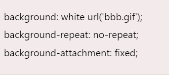
- It enhances the legibility of style sheets. The background property is a complex property in CSS, and if it is combined with color, the complexity will further increase.
- Color is an inherited property while the background is not. So this can make confusion further.
- You can create classes for use on multiple tag types in the document.
- You can use selector and grouping methods to apply styles in complex situations.
- No extra download is required to import the information.
- Simple selectors (select elements based on name, id, class)
- Combinator selectors (select elements based on a specific relationship between them)
- Pseudo-elements selectors (select and style a part of an element)
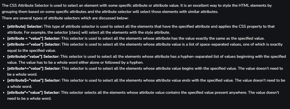
- Attribute selectors (select elements based on an attribute or attribute value)
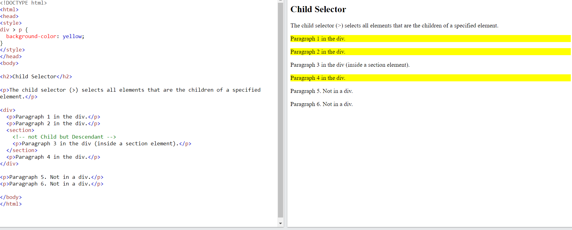
The descendant selector matches all elements that are descendants of a specified element.

The child selector selects all elements that are the children of a specified element.
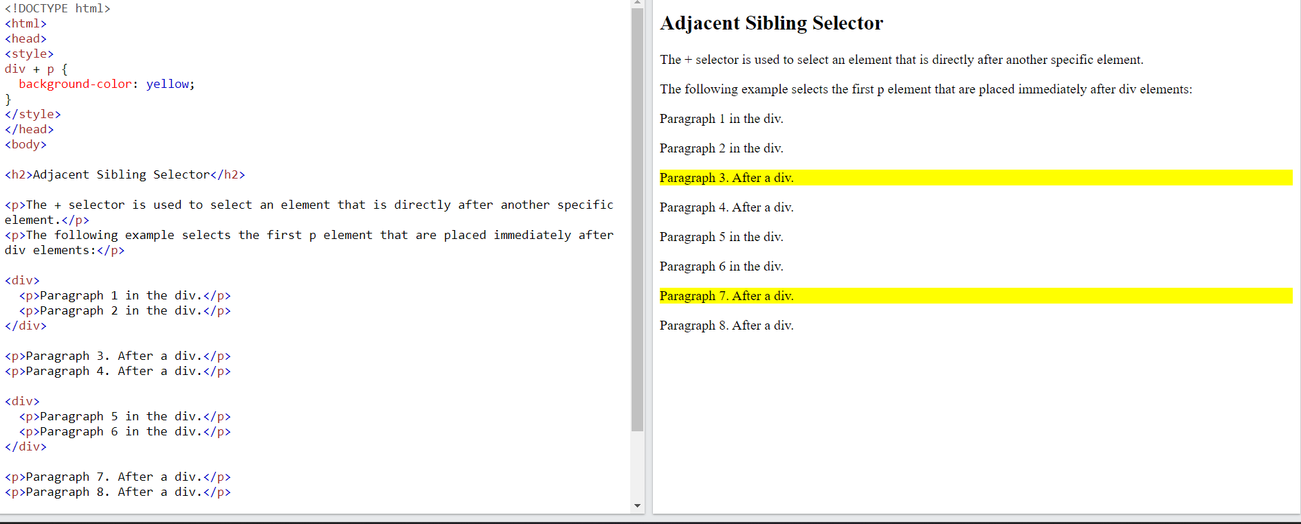
The adjacent sibling selector is used to select an element that is directly after another specific element.
Sibling elements must have the same parent element, and "adjacent" means "immediately following"
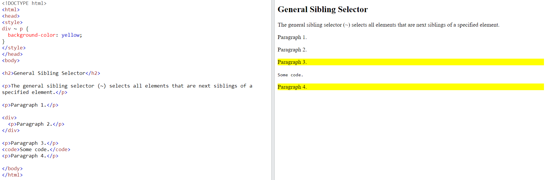
The general sibling selector selects all elements that are next siblings of a specified element.
- Style an element when a user mouses over it
- Style visited and unvisited links differently
- style an element when it gets focus
For example, it can be used to Style the first letter, or line, of an element and insert content before, or after, the content of an element
- Selector - Selector indicates the HTML element you want to style.
- Declaration Block - The declaration block can contain one or more declarations separated by a semicolon.

CSS Class Selector
CSS Id Selector

- Physical tags are referred to as presentational markup while logical tags are useless for appearances.
- Physical tags are newer versions, on the other hand, logical tags are old and concentrate on content.
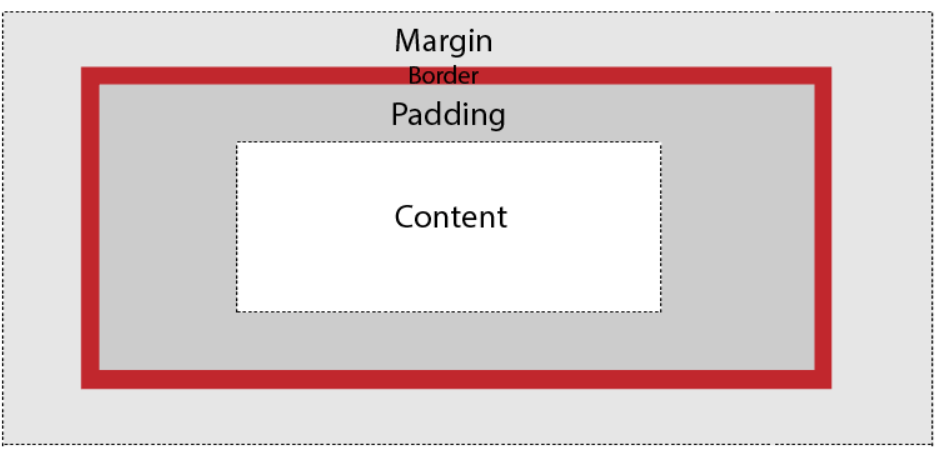
The elements are:
- Margin - It removes the area around the border. It is transparent.
- Border - It represents the area around the padding
- Padding - It removes the area around the content. It is transparent.
- Content - It represents the content like text, images, etc.
To understand its purpose and origin, let's take a look at its print display. In the print display, an image is set into the page such that text wraps around it as needed.

The closest option is to use the 'initial' property value, which restores the default CSS values, rather than the browser's default styles.
An element with a higher z-index is always stacked above than a lower index.
Z-Index can take the following values:
Auto:
Sets the stack order equal to its parents.Number:
Orders the stack order.Initial:
Sets this property to its default value (0).Inherit:
Inherits this property from its parent element.

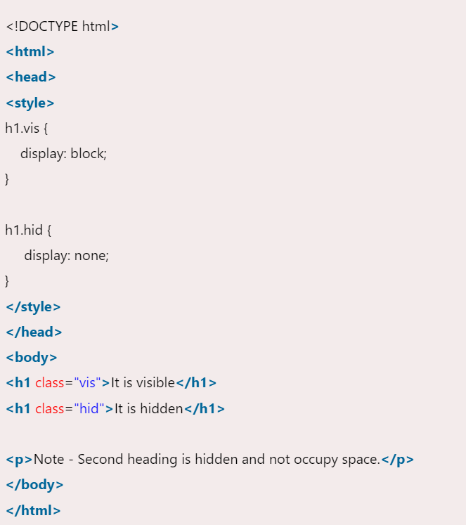
display: none also hides the element but not occupy space. It will not affect the layout of the document.
- Text-color
- Text-alignment
- Text-decoration
- Text-transformation
- Text-indentation
- Letter spacing
- Line height
- Text-direction
- Text-shadow
- Word spacing
States of Link: Before discussing CSS properties, it is important to know the states of a link. Links can exist in different states and they can be styled using pseudo-classes.
There are four states of links given below:
- a:link:This is a normal, unvisited link.
- a:visited: This is a link visited by a user at least once.
- a:hover:This is a link when the mouse hovers over it.
- a:active:This is a link that is just clicked.
- Fixed
- Static
- Relative
- Absolute
- Sticky
1. Fixed: Any HTML element with position: fixed property will be positioned relative to the viewport. An element with fixed positioning allows it to remain at the same position even as we scroll the page. We can set the position of the element using the top, right, bottom, and left.
2. Static: This method of positioning is set by default. If we don’t mention the method of positioning for any element, the element has the position: static method by default. By defining Static, the top, right, bottom and left will not have any control over the element. The element will be positioned with the normal flow of the page.
3. Relative: An element with position: relative is positioned relatively with the other elements which are sitting at top of it. If we set its top, right, bottom, or left, other elements will not fill up the gap left by this element.
4. Absolute: An element with position: absolute will be positioned with respect to its parent. The positioning of this element does not depend upon its siblings or the elements which are at the same level.
5. Sticky: Element with position: sticky and top: 0 played a role between fixed & relative based on the position where it is placed. If the element is placed in the middle of the document then when the user scrolls the document, the sticky element starts scrolling until it touches the top. When it touches the top, it will be fixed at that place in spite of further scrolling. We can stick the element at the bottom, with the bottom property.
- visible
- hidden
- scroll
- auto
2. Hidden:The overflow is clipped and the rest of the content is invisible.
3. Scroll:The overflow is clipped but a scrollbar is added to see the rest of the content. The scrollbar can be horizontal or vertical.
4. Auto: It automatically adds a scrollbar whenever it is required.
Overflow-x and Overflow-y: This property specifies how to change the overflow of elements. x deals with horizontal edges and y deals with vertical edges.
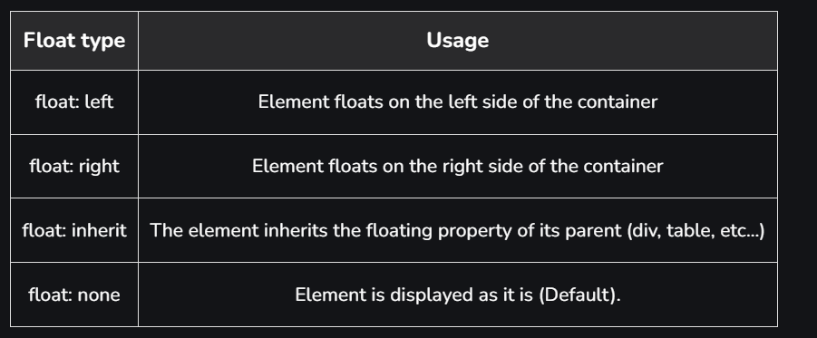
Float is a CSS property written in a CSS file or directly in the style of an element. The float property defines the flow of content. Below are the types of floating properties:
There are six main types of 2D transformations which are listed below:
- translate()
- rotate()
- scale()
- skewX()
- skewY()
- matrix()
There are three main types of transformation which are listed below:
- rotateX()
- rotateY()
- rotateZ()
Transitions in CSS allow us to control the way in which transition takes place between the two states of the element.
The transition allows us to determine how the change in color takes place. We can use the transitions to animate the changes and make the changes visually appealing to the user and hence, giving a better user experience and interactivity. In this article, we will show you how to animate the transition between the CSS properties.
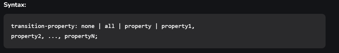
There are four CSS properties that you should use, all or in part (at least two, transition-property and transition-duration, is a must), to animate the transition. All these properties must be placed along with other CSS properties of the initial state of the element:transition-property:This property allows you to select the CSS properties which you want to animate during the transition(change).
transition-duration:This property allows you to determine how long it will take to complete the transition from one CSS property to the other.

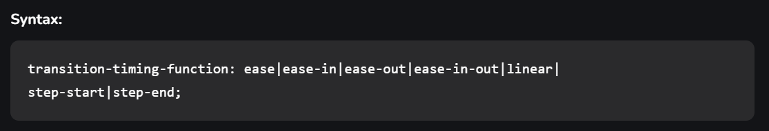
Here, time can be in seconds(s) or milliseconds(ms), you should use ‘s’ or ‘ms’ after the number (without quotes).transition-timing-function:This property allows you to determine the speed of change and the manner of change, during the transition. Like, the change should be fast at the beginning and slow at the end, etc.
transition-delay:This property allows you to determine the amount of time to wait before the transition actually starts to take place.
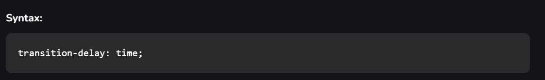
Here, again, time can be in seconds(s) or milliseconds(ms), and you should use ‘s’ or ‘ms’ after the number (without quotes).The Shorthand Property You can combine all the four transition properties mentioned above, into one single shorthand property, according to the syntax given below. This saves us from writing long codes and prevents us from getting messy. Note the ordering of property, it has significance.

CSS Animations is a technique to change the appearance and behavior of various elements in web pages. It is used to control the elements by changing their motions or display. It has two parts, one which contains the CSS properties which describe the animation of the elements and the other contains certain keyframes which indicate the animation properties of the element and the specific time intervals at which those have to occur.
The @keyframes rule: Keyframes are the foundations with the help of which CSS Animations works. They define the display of the animation at the respective stages of its whole duration. For example: In the following code, the paragraph changes its color with time. At 0% completion, it is red, at 50% completion it is of orange color and at full completion i.e. at 100%, it is brown.
Example:
output:
syntax:

Property Values:
- content-box:This is the default value of the box-sizing property. In this mode, the width and height properties include only the content. Border and padding are not included in it i.e if we set an element’s width to 200 pixels, then the element’s content box will be 200 pixels wide, and the width of any border or padding will be added to the final rendered width.
- border-box:In this mode, the width and height properties include content, padding, and borders i.e if we set an element’s width to 200 pixels, that 200 pixels will include any border or padding we added, and the content box will shrink to absorb that extra width. This typically makes it much easier to size elements.
Media queries can be used to check many things:
- width and height of the viewport
- width and height of the device
- Orientation
- Resolution
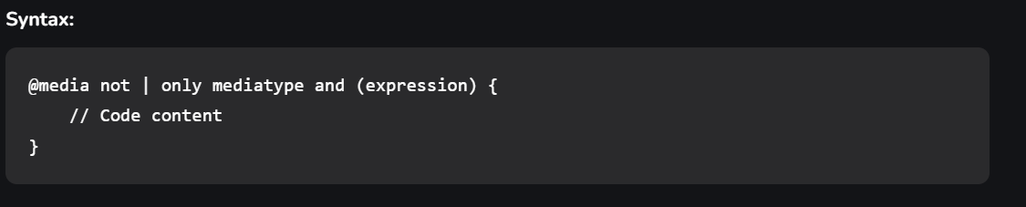
A media query consist of a media type that can contain one or more expression which can be either true or false. The result of the query is true if the specified media matches the type of device the document is displayed on. If the media query is true then a style sheet is applied.
It is also called a flexible box model. It is basically a layout model that provides an easy and clean way to arrange items within a container. Flexbox is different from the block model which is vertically biased and the inline which is horizontally biased. Flexbox was created for small-scale layouts and there’s another standard called grids which are geared more towards larger-scale layouts, It works similar to the way to Twitter bootstrap grid system works. Flexbox is responsive and mobile-friendly. To start with flexbox firstly create a flex container. To create a flex container set the display property to flex.
Flex Properties:- flex-direction
- flex-wrap
- flex-flow
- justify-content
- align-items
- align-content
It is a CSS property that offers a grid-based layout system, with rows and columns, making it easier to design web pages without floats and positioning.

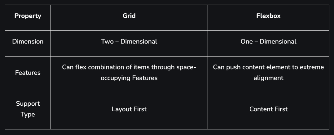
- Dimensionality and Flexibility:
- Flexbox offers greater control over alignment and space distribution between items. Being one-dimensional, Flexbox only deals with either columns or rows.
- The grid has two-dimension layout capabilities which allow flexible widths as a unit of length. This compensates for the limitations in Flex.
- Alignment:
- Flex Direction allows developers to align elements vertically or horizontally, which is used when developers create and reverse rows or columns.
- CSS Grid deploys fractional measure units for grid fluidity and auto-keyword functionality to automatically adjust columns or rows.
- Item Management:
- Flex Container is the parent element while Flex Item represents the children. The Flex Container can ensure balanced representation by adjusting item dimensions. This allows developers to design for fluctuating screen sizes.
- Grid supports both implicit and explicit content placement. Its inbuilt automation allows it to automatically extend line items and copy values into the new creation from the preceding item.
The External Style Sheet (using HTML Tag) is the best method that is used to link the element. Maintaining and re-using the CSS file across different pages is easy and efficient. The tag is placed in the HTML
element. To specify a media type=”text/css” for a Cascading Style Sheet@import rule: The @import rule is used to import one style sheet into another style sheet. This rule also supports media queries so that the user can import the media-dependent style sheet. The @import rule must be declared at the top of the document after any @charset declaration.
Characteristics of @import:
- The @import at-rule is used to import a style sheet into an HTML page or another style sheet.
- The @import at-rule is also used to add media queries, therefore import is media-dependent.
- It is always to be declared at the top of the document.

All CSS style sheets are case-insensitive, except for portions that are not under the control of CSS. For example, the case sensitivity due to values of the HTML attributes “id” and “class”, font names, and URIs lies outside the scope of this specification.
CSS allows the animation of HTML elements without using JavaScript. An animation lets an element systematically and with proper timing, change from one style to another. You can change whatever CSS properties you want, and end a number of times, as you want it. To use CSS animation, you must first specify some @keyframes for the animation. @keyframes will describe which styles that element will have at specific times. We will be using a basic example such as the animation of a battery charging.
The @keyframes property has the option to divide the animation time into parts/percentage and perform an activity that is specified for that part of the whole duration of the animation. The @keyframes property is given to each animation according to the name of that animation. It allows you to run the animation infinitely as well.
Keyframes are the foundations with the help of which CSS Animations works. They define the display of the animation at the respective stages of its whole duration. For example: In the following code, the paragraph changes its color with time. At 0% completion, it is red, at 50% completion it is of orange color and at full completion i.e. at 100%, it is brown.
Example:
Counters in CSS are basically variables that can be used for numbering and values of CSS counters may be incremented by CSS rules. For example, CSS counters can be used to increment the numbering of the headings automatically. In HTML, the tag is used to give the ordered numbers to list items but CSS contains a counter to give order elements in some other fashion.
CSS counters properties: CSS counters contains the following properties:
- counter-reset: It is used to reset a counter.
- counter-increment: It basically increments a counter value.
- content: It is used to generate content.
- counter() or counters() function: The value of a counter can be displayed using either the counter() or counters() function in a content property. These two functions basically used to add the value of a counter to the element.
Pagination is the process of dividing the document into pages and providing them with numbers.
Types of Pagination:There are many types of pagination in CSS. Some of them are given below:
- Simple Pagination
- Active and Hoverable Pagination
- Rounded Active and Hoverable Buttons
- Hoverable Transition Effect
- Bordered Pagination
- Rounded Border Pagination
- Centered Pagination
- Space between Pagination
- Pagination size
The box-reflect property is used to create an image reflection.
Attributes:- below:to create a reflection below the original image
- above:to create a reflection above the original image
- left:to create a reflection on the left side of the original image
- right:to create a reflection on the right side of the original image
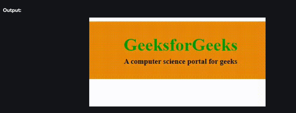
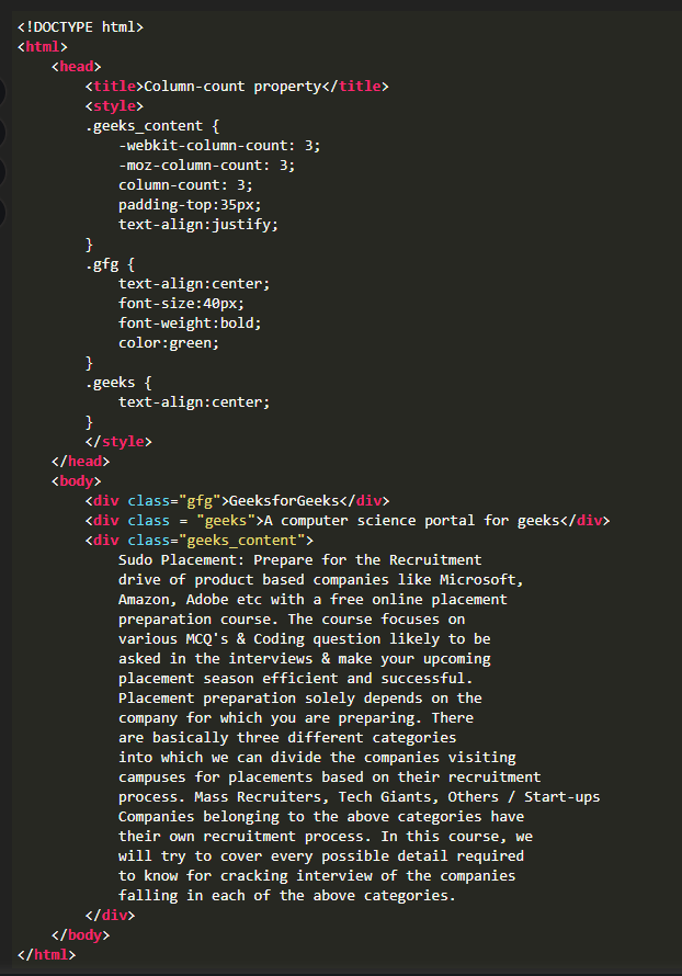
The multiple columns are used to create column layouts on the web pages. There are many column properties in CSS which are listed below:
- column-count
- column-gap
- column-rule-style
- column-rule-width
- column-rule-color
- column-rule
- column-span
- column-width
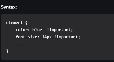
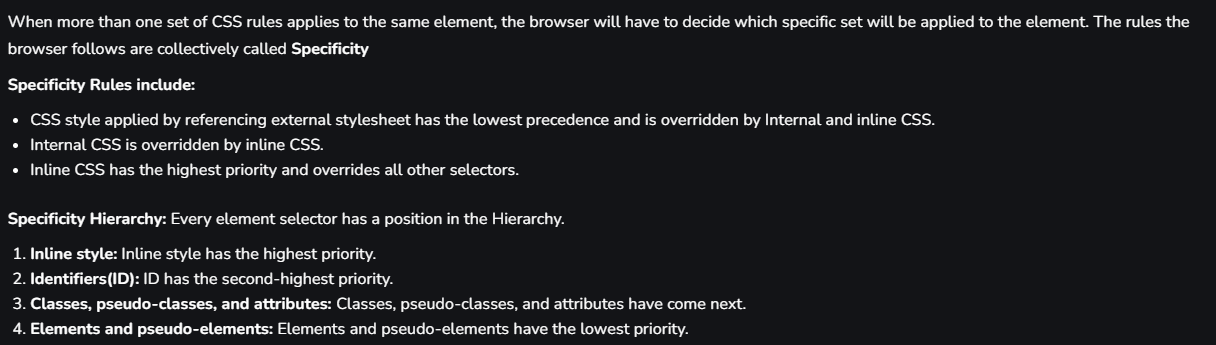
The !important property in CSS is used to provide more weight (importance) than normal property. In CSS, the !important means that “this is important”, ignore all the subsequent rules, and apply !important rule and the !important keyword must be placed at the end of the line, immediately before the semicolon.
- In other words, it adds importance to all the sub-properties that the shorthand property represents.
- In normal use, a rule defined in an external style sheet which is overruled by a style defined in the head of the document, which in turn, is overruled by an inline style within the element itself (assuming equal specificity of the selectors).
- Defining a rule with the !important attribute that discards the normal concerns as regards the later rule overriding the earlier ones.
- So, it is used for overriding the styles that are previously declared in other style sources, in order to achieve a certain design.
The main difference between CSS3 and CSS2 is that CSS divides different sections into modules and supports many browsers. It also contains new General Sibling Combinators responsible for matching similar elements.
- speech
- audio
- visual
- tactile media
- continuous or paged media
- grip media or bitmap
- interactive media
VH and VW are CSS units used to measure viewport height and viewport width respectively in percentage form in the responsive design techniques. E.g. If the height of the browser is 1000px, then VH is 1/100 of the height of the viewport that is 1000px*(1/100) = 10px, which is the height of the browser. The same applies to VW (viewport width).